

There's a group of ten attacking infantry in the late war M2 French gas mask, a group of eight casualties and (really as a Late War German addition) a Stosstruppen Command Group. The French are Old Glory figures, the Germans are Great War Miniatures. Sadly, no one else but Old Glory produces late War French in gas masks, which is odd considering the amount of gaz floating around the battlefields of Verdun and the Chemin des Dames.


The Old Glory figures were a bit of a revelation when I painted them. It was a very important lesson in my book of not judging a figure at first sight. The attacking figures arrived looking very shiny (making it difficult to pick out the detail) and with the bayonets bent in weird surrealist angles. But they are a very good match size-wise and bulk-wise for the Great War Miniatures Germans I've already painted. They really came to life once the rifles and bayonets were straightened and they were undercoated. I like the dynamic pose of the attacking troops – they’ll be perfect for trench cleaners, “les nettoyeurs de tranchees”.

As for the multiple figure bases, there's a bit of a story to that. Normally the only multiple figures for the skirmish games we play are weapons teams - so a Vickers machine gun, Lewis gun team and so on. However, when the Old Glory figures arrived their rifles and bayonets were, as I mentioned, twisted at strange angles of which Picasso or Dali would be proud. The rifles folded back fairly easily with the metal seeming quite pliable - not brittle, but just potentially prone to bending. I thought that they'd be helped by basing two to a base, with none of the rifles and bayonets extending over the circumference of the base. The more I thought about it, the more I really liked the effect. The bigger base (40mm) gives a lot more scope for modelling the ground effects. As the troops are a section of trench cleaners, it makes sense for them to be in a closer order - very L'Attaque à Outrance!


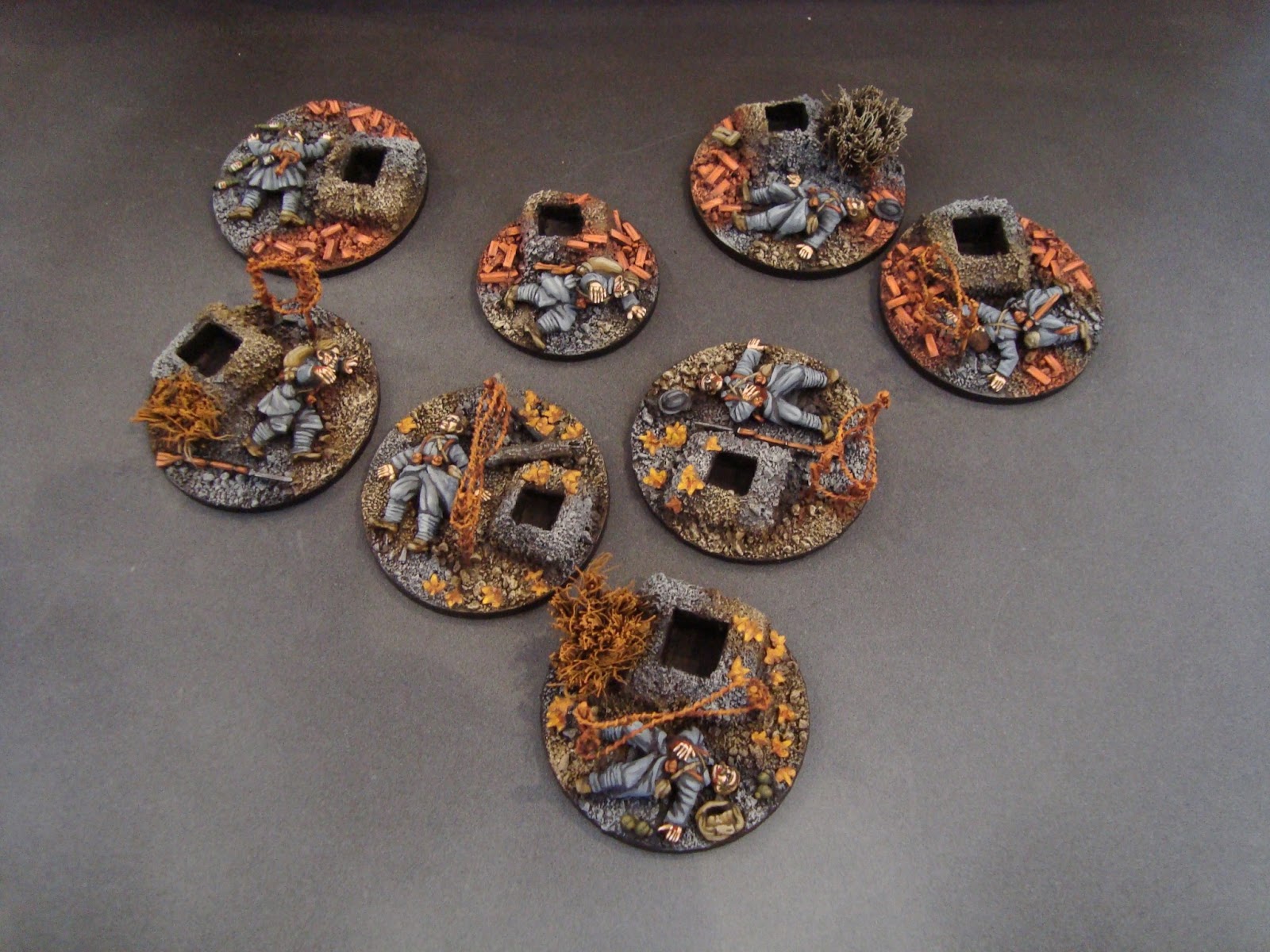
The French casualties were just terrific figures to work with. They reminded me a lot of old-style Perry figures from the Franco-Prussian War range now offered by Foundry. I added a few bedding rolls, mess tins, pinard bottles and water bottles. I also made a sack of hand grenades and mini-grenades from greystuff. No, he’s not collapsed after an energetic game of boules (as suggested by my wife!).


I also wanted a different ground effect on the bases than I’ve gone for on my German and British troops. Although I’ve done some French figures with brickwork and rubble, I’ve also experimented with some fallen leaves. These seemed to suit the atmosphere of the late winter woods around Verdun or for the late winter battles in Champagne in 1915 – definitely not “home before the leaves have fallen”. I quite like the contrast between the autumn colouring (Plaka Braun, Vallejo Light Brown, Vallejo Orange, Vallejo Yellow, blended) and the prevailing base colours of grey and brown. Let me know if you like them.
You'll have seen in earlier posts that I've been working hard on Horizon Bleu as a colour. I've tried with these figures to see how it would blend with a number of shade tones. I found that the following painting formula looks reasonable, although the experimenting is far from over:
(i) a base of 50% Vallejo Neutral Grey and 50% Vallejo French Mirage Blue;
(ii) a shade tone applied on the base of Vallejo German Grey mixed with a little (say a large dab but no more) of Vallejo Neutral Grey;
(iii) a highlight of Vallejo White mixed with the base tone of 50% Vallejo Neutral Grey and 50% Vallejo French Mirage Blue (adding more white to suit the top highlights).


Life-long Francophiles (including myself) may be horrified about using Vallejo German Grey on Great War French figures - I confess it troubled me as well, hence the dab of Vallejo Neutral Grey to the shade colour!
Still on Horizon Bleu, Curt (yes, from Analogue Hobbies) sent me this link to these stunning photos of early twentieth century Paris. You can see that the Horizon Bleu is very blue indeed. I am guessing that the colours have been enhanced by the photo processing, and that soldiers on leave may well have not worn their faded "campaign dress" in the Place Vendôme and the Bois de Boulougne. Even so, the tone looks to be significantly more blue than I have on my figures. So I'll be adding a little more blue to the next set of figures to be painted.
Still on Horizon Bleu, Curt (yes, from Analogue Hobbies) sent me this link to these stunning photos of early twentieth century Paris. You can see that the Horizon Bleu is very blue indeed. I am guessing that the colours have been enhanced by the photo processing, and that soldiers on leave may well have not worn their faded "campaign dress" in the Place Vendôme and the Bois de Boulougne. Even so, the tone looks to be significantly more blue than I have on my figures. So I'll be adding a little more blue to the next set of figures to be painted.


For the record, I doubt there is an easy answer, or indeed even a single answer, to painting Horizon Bleu. As Rusty, from Hurry Up and Wait, mentioned in one of the comments in a previous post, different supplies of cloth used different dyes, were differently aged and were used in different cuts of greatcoats. Ashley from Paint-It-Pink, in another comment, also mentioned the excellent point that on the wargames table top colours need to be accentuated so that the figures stand out on the terrain - just as I'm getting paranoid about Horizon Bleu, I'm not getting paranoid about the (admittedly colourfully painted) camouflaged stallhelm on the German Stosstruppen.
So why the discussion? Well, first, I think it's an interesting discussion about painting wargames figures and colours. Put simply, we like to try to get our figures' uniform colours right. And second, I think that Horizon Bleu is such a distinctly French colour that in building a French army of the 1916 - 1918 period it's really one of those things I should try to get right, even if I don't manage it!
So, in conclusion, please let me know what you think of the Horizon Bleu colour I've ended up with here. And please don't worry if you don't think I'm there yet - I've very happy to read objections, criticisms and brickbats in the comments!
Also, as I mentioned above I painted up a German Stosstruppen company command group. I’ve done a couple of German command groups before, but I wanted something more “front-line” and action-focused. The Great War Miniatures German troops armed with MP18 Bergmann sub-machine guns gave me the chance. The command group will be placed on the German baseline in an up-coming game, so they gave me the chance to play around with a diorama as well.


***
Book Reviews - I should also finish up this post by adding the following by way of explanation of the various reviews I've been putting on this blog about Verdun.
When I start a new period, or a new wargames army or force, I usually have a real problem knowing what to buy in the way of books, supporting rules, army lists, and boardgames. My idea behind the book reviews here was simply to let people know what I'd read and what I'd found useful in putting together a skirmish wargames force and in playing a few games.
In writing the reviews I've tried to think of the things that you, the readers, would find useful. And I'm guessing that while a lot of you might be looking for similar things to me (i.e. how much use is the book to a miniature wargamer), quite a few of you I'm guessing will have wider interests in history, tactics and strategy, the Great War generally, France and so on.
With all that in mind I've tried to keep the reviews fairly general. I've also tried to have this question in mind - if I was starting from scratch, would I need to buy (or borrow) this book (or game) and/or would my wargames be a lot better for having bought it?
There are another six books to be reviewed before 20 March 2013 (to tie in with the Analogue Hobbies Challenge), plus a film (no clues for guessing which) and a boardgame. I'll try and do at least one review each week, with a few extras over the weekends.
I should have mentioned all this previously, so my apologies for not doing it earlier.
Have a great weekend!

Magnificent!
ReplyDeleteEspecially like the Stoßtruppen command base!
Thanks DHC! Much appreciated
DeleteStunning work Sidney !!!
ReplyDeleteBest regards Michael
Thanks Michael!
DeleteWhat a treat to see these here Sidney, stunning work Sir; the command stand is a joy to behold.
ReplyDeleteThanks Michael - glad you liked the command base.
DeleteA wonderfully informative post Sidney and stunning miniatures as ever. As with all of your work, the base is as important as the figure. Not only is my taste for gaming WW1 growing but my French language is also improving! Incidentally I don't know if you are aware of the 28mm figures from the French company Forgotten Glorious (http://forgottenglorious.blogspot.fr/2012/02/secure-online-payment-available.html). There are some very nice painted examples (those from Captain Blood are very vibrant) and threads give suggestions for colour mixes. I was so impressed that I ordered some figures immediately. Yours Aye, Rusty.
ReplyDeleteThanks Rusty. Really chuffed that you like what you're seeing. I've not seen the Forgotten Glorious figures at first hand. I am very tempted by them. Do you know how they match up size-wise with figures like Great War Miniatures?
DeleteSidney, these are superb. You have made those OG figures very tempting, something I wouldn't have considered until seeing yours painted.
ReplyDeleteThanks for sharing your paint formula with the blue, right or wrong it looks damn good to me.
Cheers,
Pat.
Thanks Pat. The OG figures were a real surprise once they were undercoated - they really didn't look much coming out of the packet, but the undercoat and paint really helped them. I got great service from Old Glory UK - they were very helpful and fast in sending the figures through. I'm doing some Brigade Games late war French at present, so you'll be able to see how the two sets of figures stack up against each other size-wise and bulk-wise.
DeleteSickenly fantastic work! Just love the mix of colour you used, I like the blue you've used as well, its certainly a difficult colour to work out.
ReplyDeleteThanks Ray - really pleased you like where I'm heading!
DeleteFantastic work here Sidney. Lovely colours.
ReplyDeleteThanks Rodger!
DeleteSuperbly done - who would think trench warfare could look so lovely! Dean
ReplyDeleteHahaha....thanks Dean. I doubt it was as colourful in real life!! But I don't think it stretches things too far to make sure the wargames figures stand out on the table.
DeleteI think your horizon blue is fine, doing different shades is a good idea, I do this with my Germans, I will see if I can find the photo's I took at Les Invalides I know that the shades were different on the examples there. The stormtrooper base is rather splendid, a great use of the figures it really seems to capture a moment in time.
ReplyDeleteThanks Phil - I'd be really interested in your photos.
DeleteI agree with Phil that the French blue looks right.
ReplyDeleteThere's a photo I took when I visited the French Army Musuem at Paris in 2011 in my blog, for comparison
http://mylardiesgames.blogspot.com.es/2011/04/touring-paris-and-le-musee-de-larmee.html
The German command vignette is outstanding
And I'll be looking forward to those books reviewstoo!
Thanks Benito. That photo is really helpful, thanks. Not that far away from where I ended up with this batch (which is reassuring!).
DeleteWonderful work on all of it and your different hues on the colours is superb!
ReplyDeleteChristopher
Thanks Christopher!
DeleteGreat update as per usual Sid. Those Frenchies look fantastic - simply amazing that they're the Old Glory figures. The Jerries are top notch also, i love the dioramic base.
ReplyDeleteThanks for the link to the photos, I'd not seen those before. For all the allure of B&W photography, it is amazing to see colour. Amazing how much - and how little - has changed.
Re Bleu Horizon, i muddled around trying to get a match for quite a while and came up with the following - which i'm not 100% happy with:
Base: 75% VMC Mirage Blue / 25% VMC Dark Bluegrey
Mid: 50% Mirage Blue / 50% VMC Grey Blue
Highlight by adding white.
It ends up looking like
http://www.sdean-forum.co.uk/phpBB3/download/file.php?id=432&mode=view
http://www.sdean-forum.co.uk/phpBB3/download/file.php?id=431&mode=view
I'm stealing your basetone to give it a bit more contrast :)
Can't wait to see more
Ben
Ben, thanks for the comment, mate. I very much like your Horizon Bleu - it's slightly more "bleu" than mine - which is the result of adding the VMC BlueGreys. I'm going to give that a go as well as my formula and see how they match up. Your guys are super - I really like the muddy/ dirty feel - very Verdun! The skin tone is tremendous.
DeleteI should hopefully have more of my BonHommes (apparently, they didn't ike being called "Poilus") to post at the weekend (this week's been frantic work-wise). Thanks again!
Yes, I know it is a commercial (for Stella-Artois) and the colors muted for the black and white film feel, but the dull grayish-blue of the returning soldiers uniforms very much portray my idea of the colour.
Deletehttp://www.youtube.com/watch?v=U42yJ9XJ19M
Colourized photos of the era are extremely interesting. My mother-in-law in her youth did such colourizing of photos and so you have artist's interpretations to contend with. Even on today's digital photos, lighting certainly affects the shade and tone of a color to a vast degree.
The French Horizon-Blue does evoke much discussion
a great project which I continue to follow
cheers,
DougH
a quick follow-up : the commander to the fore facing the viewer in the photo of your site's banner seems[ to me ] to have the right tone of color.
DeleteAll this study has me longing to work on WW1 French for goodness sakes! Perhaps I should just view your great blog and do it vicariously!
DougH
Wonderful painting once again Sidney. I am rather taken by your Poilu and I think your horizon bleu is fine, though I do agree a little more 'blue' in the mix may brighten them a little. Terrific update indeed!
ReplyDeleteThanks Graeme. A little more blue has duly been added and the results will be posted soon!
DeleteTruly awe inspiring painting, I'm just getting back into gaming after a long long break... quick question about the dice recess on the casualty base, how do you use it within your games? Is it to do with the number of casualties sustained or the amount of shock on the group?
ReplyDeleteThanks BadDog. Welcome back to the hobby! The dice recesses mark "shock" or "disorder" for the unit with which the base is with. We used to place a small dice next to the unit, but I got a bit frustrated with how often this would be knocked, or roll over on the terrain. Having a base and a dice recess solve that - and I liked trying to make a feature out of the bases on which the dice recesses are positioned.
DeleteWonderful work on those stands! Fantastic painting style, and great bases too!
ReplyDeletePhil.